Contact Us
Menu
Mastering Development Efficiency with Tailwind CSS: Best Practices
In the fast-paced world of web development, efficiency is key. As technology evolves, so do the tools and practices developers employ to create sleek, responsive, and maintainable websites. One such tool that has gained significant popularity is Tailwind CSS, a utility-first CSS framework that streamlines the styling process and enhances the overall development experience. In this article, we'll explore how Tailwind CSS aligns with the best development practices, empowering developers to build exceptional user interfaces quickly and precisely.

Efficient Styling with Utility-First Approach
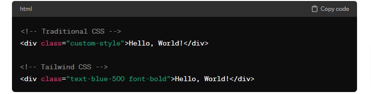
Traditional CSS often involves writing custom styles for every element, resulting in lengthy stylesheets and increased development time. Tailwind CSS takes a different approach with a utility-first methodology. Instead of creating custom classes, developers use pre-defined utility classes that directly apply styles to HTML elements. This approach promotes consistency, reduces redundancy, and accelerates the styling process.
Responsive Design Made Easy
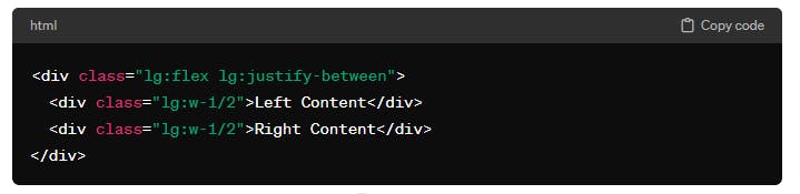
Tailwind CSS simplifies the implementation of responsive design principles. With built-in classes for different screen sizes, developers can create layouts that adapt seamlessly to various devices. The framework includes intuitive breakpoints, allowing for a responsive design without the need for media queries cluttering the stylesheet.
Customization without Sacrificing Speed
Tailwind CSS is designed to be highly customizable, allowing developers to tailor the framework to their specific needs. With the use of configuration files, it's possible to add, modify, or remove styles according to project requirements. This flexibility doesn't come at the cost of speed – Tailwind's Just-In-Time (JIT) compiler optimizes the final CSS output, ensuring that only the necessary styles are included in the production build.
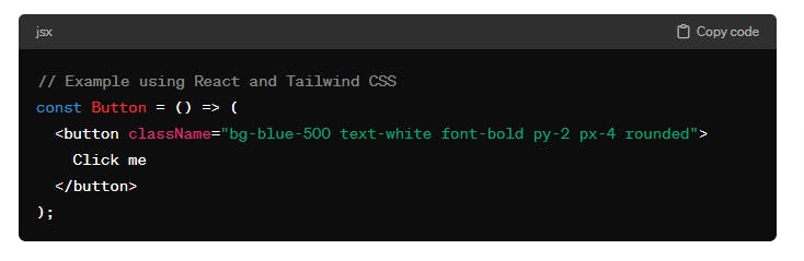
Component-Based Development
In modern web development, the shift towards component-based architectures is evident. Tailwind CSS seamlessly integrates with component-based frameworks like React, Vue.js, and Angular. By utilizing utility classes within components, developers can maintain a clear separation of concerns, making it easier to manage and scale their projects.